| FORUM SHIRT LOGO | | 1. more proper lettering, X falls to the right, bird is leaving a tiny air trace behind him. | | 50% | [ 6 ] | | 2. lettering is a bit curved, X Falls to the RIGHT, bird is attached to the X. | | 8% | [ 1 ] | | 3. lettering is a bit curved, X Falls to the LEFT, bird is attached to the X. | | 17% | [ 2 ] | | 4. more proper lettering, X falls to the right, bird is attached to the X. | | 25% | [ 3 ] |
| | Total Votes : 12 | | | | Poll closed |
|
molkoqueen
Admin

Age : 39
Location : germany
Posts : 503
 |  Subject: YOUR FORUM SHIRT! .... Thu 13 May 2010 - 20:59 Subject: YOUR FORUM SHIRT! .... Thu 13 May 2010 - 20:59 | |
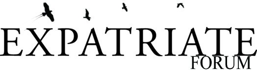
| .... what will it look like? you choose! what design do you like best? vote here. and now. those aren't the final logos. the winning logo has to be "vector-ized", so it can be printed on shirts, without losing it's good quality. maybe i'll have to change tiny details. but nothing you'll notice. the idea, the lettering, the birds, and the position of everything will stay the same! voting ends 23rd may 2010.
1. more proper lettering, X falls to the right, bird is leaving a tiny "air" trace behind him.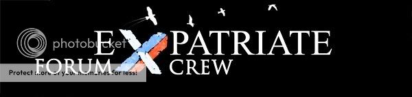 __________________________________________________________________________________________________________________ 2. lettering is a bit curved, X Falls to the RIGHT, bird is attached to the X.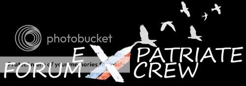 __________________________________________________________________________________________________________________ 3. lettering is a bit curved, X Falls to the LEFT, bird is attached to the X.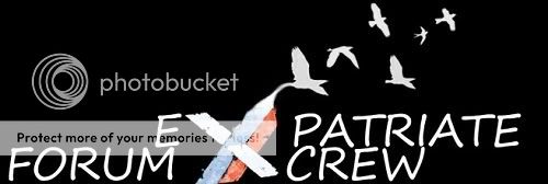 __________________________________________________________________________________________________________________ 4. more proper lettering, X falls to the right, bird is attached to the X.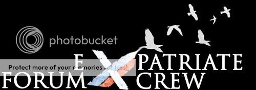
Last edited by molkoqueen on Wed 9 Jun 2010 - 21:11; edited 2 times in total | |
|
molkoqueen
Admin
Age : 39
Location : germany
Posts : 503
| | Subject: Re: YOUR FORUM SHIRT! .... Mon 17 May 2010 - 6:05 | |
| | |
|